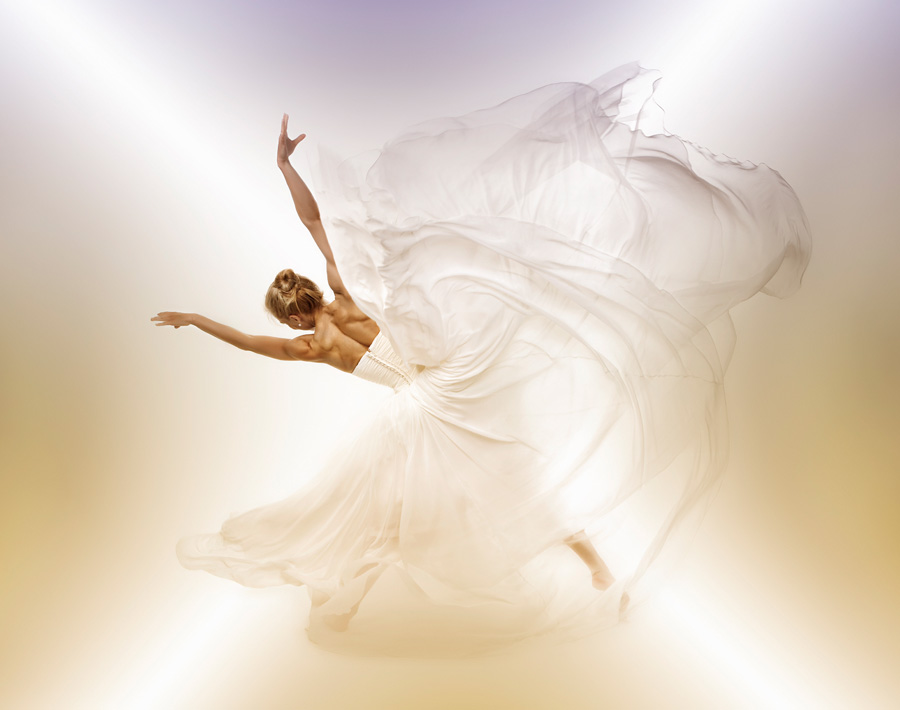
The idea developed after being inspired by a few internationally acknowledged dance photographers. I knew one ballet dancer, who was prepared to model for me, and found a white wedding dress which could work. The idea of the photo shoot was simply to get her to move around, combining classic dance poses with the dress being thrown around to get movement.
This is one shot, although I tried make more of the dress in the picture. I think it worked better as a “stand alone” shot.
Canon 5D with a Canon 28-70mm f/2.8 lens.
Shutter 1/160
Aperture f/10.0
ISO 100
I had the model move around, throwing the dress in different directions, on a white matte background. To ensure the white background did not become too prominent, I had two studio lights directed down at it. Then with the addition of one large fill, and one long strip light on the model I achieved the lighting effect I was after. The tricky part was preserving the texture of the dress, and still get the overall white feeling. See lighting set-up diagram below.
What came out from an UN-touched raw file was this:
The final shot was edited from raw, using Capture One, and then Photoshop on a PC.
To get the overall “white feeling” in the shot, I used curves, and masked out the dancer and her dress. This was a difficult job because I did not want to get any grey in her dress. I also removed some birth marks, and the strap of her dress, that was swung across her back and for me provided a distraction.
To do the editing I first duplicated the layer, masked and blurred it (Gaussian blur at approximately 16), and then applied a reflected gradient to the background to give it a little more impact. I then duplicated this layer and with white as the colour, used the reflected gradient tool again but this time I reduced the opacity of this layer to around 30%. Later, I reduced the opacity of the blurred layer and added the light and bi-colour effects, using a combination of purple and orange
Her body was at this point was yellow/orange, and some colour adjustments and reduction in saturation were needed. Finally, I sharpened her back a little, using the unsharp mask. This brought out her muscles even more making her back more dramatic
Initially, I was satisfied with this image before the color effects, but once I had played around in Photoshop, experimenting with the colour effects, my eyes popped out!! Not sure if I had made something special, I ran it by some friends of mine, who confirmed that this image looked a lot stronger than my original “white” version that it had more impact. I have no regrets now, steering away from the pure white version I have seen so many times before.
 Next post
Photography Masters Cup


